(Read more if podcast doesn't work)
Friday, 24 April 2015
Thursday, 23 April 2015
Evaluation 3
What have you learned from your audience feedback?
Digipak and poster
To gain some feedback on my ancillary tasks, I shared all 4 panels from my digipak and also my poster on the social networking website, Facebook. These pieces were complete. However, I got this feedback in time to make small changes to my final pieces according to my audience feedback. I chose Facebook as the most appropriate website to use because the majority of people who would see my post fit neatly into my target audience; both male and female, aged 12-25.
Below are the responses I got.
1.
5.
6.
7.
Because a number of these replies include similar points, I decided to split these into good points and bad points.
Good Points:
1. Logo stands out.
2. Staged images and natural images look good and well thought out.
3. The balloons and bright colours go well with the album name.
4. The white against the red background stands out.
5. The band are happy - gives a positive outlook and a fun tone.
6. The layout of the inside left is good.
7. Good choice of font.
8. Clear style throughout both ancillary texts - shows the style of the video.
9. The message from the band makes it personal.
10. Images are well edited.
Overall, I got a lot of good feedback on my pieces and decisions which I am very glad about. For my points of improvement, I tested out suggestions and had to decide whether to follow my friend's advice or stick to my own opinion.
Points of Improvement:
1. The white text on the track list is hard to see.
2. Needed a shadow behind the header text.
In a previous post, I attempted to use black font instead of white. This did not suit the style of fun and free spirit that I wanted on my texts. I also could not use any other colour because of the variety of colours in the back ground. I am very thankful for my friend's opinions, however, these particular points were not developed or changed. In the future if I were to make another piece of media similar to this, I would plan out more carefully the colours that I would use in order to be able to have a very clear text to place on top.
3. Move website links on back cover - hard to see.
This point was very helpful. When making the back cover of my digipak, I too thought that the writing of the website links was quite hard to see. However, after receiving this feedback and understanding that it was not just me looking at my work for too long, I decided to move the writing to different place so that it is now easy to read.
It is now below the logos on a red balloon. Having the constant coloured background ensures that it is easy to read for anyone. I also added the RCA (recording studio) logo in because I realised that most digipaks also give credit to the recording studio or other places involved in the production of the music or digipak.
I am very glad that I only received minimal amounts of negative feedback meaning that 7 people, all within my target audience, thought that my texts were mostly very good.
My Music Video
To gain feedback for my music video, I got together a group of 5 students within my target age range. I played my video on a large screen twice through and then asked them what they liked and what they thought I could improve. I wrote these notes onto a piece of paper and scanned them onto my computer using a Canon Lide 110 Scanner.
To gain feedback for my music video, I got together a group of 5 students within my target age range. I played my video on a large screen twice through and then asked them what they liked and what they thought I could improve. I wrote these notes onto a piece of paper and scanned them onto my computer using a Canon Lide 110 Scanner.
Good Points:
1. I like the contrast of the dull beginning compared to the colourful balloons.
2. I love the mirror scene, it's very clever.
3. Really relates to the digipak and poster designs.
4. I like that it goes through a whole day from day to night.
Points of Improvement:
1. Add the date to the end.
This suggestion was a very good idea. At first I did not have this section on the end of my video, however, the promotional video is supposed to promote when the album can be bought, so I added this to the end.
2. Add the name of the band.
At the beginning of my video, I had included my logo and also the name of the album. However, I didn't add the name of the band because I assumed that their name would probably be announced before the song was played on any popular music channels. However, this was a good thing to add just incase.
3. Some of the night scenes could have better lighting.
I agree with this statement as some of the night scenes are quite dark. If I had more time or could re-do this task then I would try to use more lighting on these darker scenes and would do more tests before going straight into filming.
Overall, I learned from my feedback that all of my 3 media texts appeal well to my target audience and, now that I have taken their suggestions into account and changed some parts, I would hope that there would be very little negative feedback if I were to do it again.
Wednesday, 22 April 2015
Tuesday, 21 April 2015
Evaluation 1
In what ways does your media product use, develop or challenge forms and conventions of real media products?
Music Video
In order for me to successfully create a music video, I first had to research conventions of popular video's similar to the one I wanted to create. I chose to use a song by 'Paramore' who predominantly create a mixture of rock and pop music. I chose to look at a few of Paramore's music video's as they are reaching the target audience that I wished to appeal to (Aged 12-25). I mainly took inspiration from Paramore's "Still into you" as this video had a lot of aspects similar to what I was hoping to create. I hoped to create a fun rock/pop video that seemed like a fun day for the band and was eye-catching and interesting to watch. 'Still into you' includes colourful, fun props such as bikes, cakes and balloons:
This rock/pop video by 'The All-American Rejects' also shares another convention with my music video. This convention is where the narrative of the video relates with the words of the song. In my video, the chorus says "Ain't it fun" and my video shows 3 friends and band members enjoying a fun day. This supports Goodwin's theory of lyrics and visuals as he states that lyrics and visuals are linked.
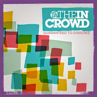
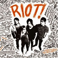
Before beginning my digipak, I researched digipaks from bands of a similar genre to mine. An obvious choice for me was the band 'Paramore' as they have been one of my style models throughout the year. I also researched 'We are the in Crowd' as they also fit neatly into the pop/rock genre.


Overall, I believe that all 3 of my media texts follow a number of conventions of rock/pop media texts. However, even though I have followed conventions, my pieces are all very unique and original and would still stand out against others in the genre.
Music Video
In order for me to successfully create a music video, I first had to research conventions of popular video's similar to the one I wanted to create. I chose to use a song by 'Paramore' who predominantly create a mixture of rock and pop music. I chose to look at a few of Paramore's music video's as they are reaching the target audience that I wished to appeal to (Aged 12-25). I mainly took inspiration from Paramore's "Still into you" as this video had a lot of aspects similar to what I was hoping to create. I hoped to create a fun rock/pop video that seemed like a fun day for the band and was eye-catching and interesting to watch. 'Still into you' includes colourful, fun props such as bikes, cakes and balloons:
The following are some screenshots from my final music video. The inspiration from these video's can clearly be seen within my final piece:
The clothes worn in these pop/rock videos already break the conventions of rock music as the clothes worn in rock video's are normally black and plain. However, because my video and these videos are mixing the rock genre with pop, which is very colourful and happy, the clothing reflects the pop genre. My main actress is wearing checked shorts and a denim jacket with patterned tights. This overall look makes her look very bright and fun. My other actors wore more casual clothing but neither of them wore any black excluding shoes. This is because I wanted my video to depict a fun day. However, at the beginning of my video, I wanted to convey a boring, repetitive day and so my main actress covered her clothing with a black cardigan. Unfortunately, during the second half of my filming, my actors had to wear coats because it was very cold and windy during both days of filming. I decided that they should all be wearing the same colour coats and so they ended up being black. However, because of the colourful background of the sky and sunset in some shots and the sparklers and fairy lights in others, the sense of colour is not lost and the tone of the video does not change.
My opening 'scene' includes my main actress, Amy, in her bedroom which is typical of a lot of videos from multiple genres. One of my style models "Still into you" also begins this way. My video then ends the same way, creating a sense of completed adventure.
In the beginning shots, I chose to utilise my advantages of being a twin and chose to make a mirror scene that otherwise would've taken a lot of editing.
I got my inspiration for this shot from a video called "We've got a big mess on our hands" by 'The Academy is' in which the main character's alter ego comes out of a mirror. However, this would have been very hard to create without very expensive video editing software and a lot more time. I believe that using my advantage as a twin was a smart idea to create such a professional looking shot.
We've got a big mess on our hands: (0:10-0:30)
My video does not have an extremely clear narrative like most pop/rock videos, but focuses predominantly on the band having a fun day and enjoying themselves. However, this beginning scene where she is pulled through the mirror after receiving a boring text ("AGAIN"), does convey a narrative of an alternate colourful universe. The very end of the video also supports this narrative as the video is played in reverse and in fast motion until she is back in bed, as if the whole video was a daydream. This leaves the video open to individual interpretation from viewers which means that people can see the video how they want to to a certain extent.
Another thing that I did which is popular of the rock/pop genre is cut quickly between short shots. This creates a sense of fun and excitement. If I wanted to create a melancholy video, I would use longer shots with more transitions and less movement. A popular convention of the rock/pop genre is having shots of the band/artist playing along with the track, mixed in with the narrative shots. Like in "Sugar, we're goin down" by 'Fall Out Boy':
However, I developed this convention by having my artist singing along with the track whilst also continuing on with the narrative and whilst my other actors continue on with the narrative. At first, I thought that the change from her singing along into other shots may have looked strange but after ending a few together, I thought that it looked very professional. I also found that there are other popular videos that are similar to this such as "Gives You Hell" by 'The All-American Rejects':
This rock/pop video by 'The All-American Rejects' also shares another convention with my music video. This convention is where the narrative of the video relates with the words of the song. In my video, the chorus says "Ain't it fun" and my video shows 3 friends and band members enjoying a fun day. This supports Goodwin's theory of lyrics and visuals as he states that lyrics and visuals are linked.
Ancillary Tasks
Before beginning my digipak, I researched digipaks from bands of a similar genre to mine. An obvious choice for me was the band 'Paramore' as they have been one of my style models throughout the year. I also researched 'We are the in Crowd' as they also fit neatly into the pop/rock genre.
Research Digipaks:


These Digipaks all contain bright, eye-catching colours. In order to follow the conventions of the pop/rock genre, I would have to make my digipak bright and eye-catching also, including vibrant colours to portray the pop aspect of rock/pop. These digipaks use other aspects to portray the rock genre. On 'We are the in Crowd's digipak and on 'Paramore's "RIOT", the rock genre is portrayed by rugged/messiness. For example, the word "RIOT" is written in a messy font to convey the rugged nature of rock music. My digipak also slightly follows this convention. I could not find a font that I wished to use and so I created my own font for the front of my digipak:
Because I wrote this myself with the computer mouse, the rugged, messy style is automatically present. I chose to use the paint brush tool with a jagged edge in order to create my desired style.
On the back of my digipak I continued on with my theme of colourful balloons and images of the band:
One of the main conventions for the back cover of a digipak is the list of song names on the back. I looked at a few examples and originally had numbers before each song name. However, when I got to song number 10, the lining became off and no longer looked as neat as I'd hoped:
I then found some examples, such as this Bob Mould digipak, that did not include numbers in it's list of songs. I really liked this design so I decided to remove the numbers from mine. I also included the links to the band's and company's social media pages and websites on the back page in order to allow customers to find out more.
My poster is very similar to my digipak as I have found that a lot of promo posters use a similar image to the one used on the digipak. For example, this promo poster for the album "Loud" by 'Rihanna' includes a very similar image to the digipak. This is to create synergy between the two items so that the audience can distinguish the link between the two easily.
However, because Rihanna is a very well known artist, for this particular album, there is more than one promo poster:
This promo poster includes the exact same image as the digipak. Even though Rihanna is not in the rock/pop genre, this group of pieces helped me to decide to use the same image on my digipak and poster.
My poster:
Also, similar to the promo posters above, I decided to include the date that the album would become available. This is always shown is large letters, almost as big as the band name or album title. This is because the poster isn't just to promote the Album, it's main job is to ensure that the album is bought. Displaying the availability date so large ensures that potential customers clearly know when they can own the album.
One style model I used to create my poster was 'Jake Bugg's debut album.
I really liked a lot of the conventions used on this poster. One convention of popular promo posters I used was displaying quotes from well known music magazines such as 'NME' and 'Kerrang'.
This can also be seen in my style model.
This poster also inspired me to use block-white lines in order to create some order on my poster. This was important as I wanted to include enough information to make the poster informative, but it needed to be clear and easy to read from a distance.
Wednesday, 15 April 2015
Completed poster
This is my completed poster. I decided that I didn't need to have a picture of the digipak cover as the base image I have used for my poster and digipak is the same and so would be recognisable anyway. This opened up a space for my logo and I then moved the album title to the middle to balance out the text and images. I also added an "Available on iTunes" image as iTunes is very popular for buying music and most artists now have music on iTunes.
Monday, 13 April 2015
Making my Poster
After choosing my image and deciding on the conventions that I liked form my research, I created this poster. This was possibly the easiest of my tasks to complete as I had already edited the image and already created the title and chosen the text. I chose to use the same text as I had used on my digipak cover in order to create synergy between the texts. This is the first draft of my poster using the conventions that I saw during my research such as;
- Using the same image as the digipak
- Large date to show when the album is available
- Mini picture of digipak
- Quotes from popular magazines
- Lines to split up information
My only problem with this draft of the poster is that I can not find a suitable place for my logo. My logo needs to be present on the poster so that my audience would know that all 3 pieces were created by the same company.
Friday, 10 April 2015
Choosing my poster image
I decided to use the image that I used for the front of my digipak for my promotional poster.
This is because this image is very recognisable and would make it easy for customers to recognise the band. This image relates well to my video as it was taken on the same day as I filmed this section. Also, by using the same image, my poster now relates with the digipak very well.
Monday, 6 April 2015
More poster research
After researching promotional posters, I decided to look at some posters along with their relating digipack. A good example that I found was Rihanna's 'Loud' album. Most promotional posters for albums have a similar image on to that of the actual album digipak. This is so that customers can see the link between the two and can easily find the album that the poster is promoting. This poster for Rihanna's album 'Loud' uses the same warm colours as the cover of the digipak.
However, because Rihanna is a well known artist, there is more than one promotional poster for this specific album. This promotional poster has the exact same image as the digipak. I believe that this is a very good idea as the poster is directly promoting the digpak even without any information.
Thursday, 2 April 2015
Promo Poster Research
I have been researching promotional alum posters from all genres.
Some promo posters, such as this Ed Sheeran one, are very simple and give little information about the album or the artist. However, Ed Sheeran is a very well known artist who already has a following and perhaps this is why there is not much information needed.


This poster for KISS is more informative, but still quite simple. This is also because KISS are a very well known band. I like the convention of having the date quite large on the poster because this is an important piece of information to promote in order to sell the album.
The final poster I have looked at is Jake Bugg's debut album. This is a good one to look at because this is his first album, meaning that he is not very well known yet. This poster has quite a lot more information on it compared to the other two. The quotes from popular, trusted rock/alternative magazines 'NME' and 'Q MAGAZINE' give the album some authenticity and also will attract readers of that magazine. I like the way that a small picture of the digipak cover is shown on the bottom of the poster as this will help interested customers be able to find the digipak quickly.
Subscribe to:
Comments (Atom)


