Music Video
In order for me to successfully create a music video, I first had to research conventions of popular video's similar to the one I wanted to create. I chose to use a song by 'Paramore' who predominantly create a mixture of rock and pop music. I chose to look at a few of Paramore's music video's as they are reaching the target audience that I wished to appeal to (Aged 12-25). I mainly took inspiration from Paramore's "Still into you" as this video had a lot of aspects similar to what I was hoping to create. I hoped to create a fun rock/pop video that seemed like a fun day for the band and was eye-catching and interesting to watch. 'Still into you' includes colourful, fun props such as bikes, cakes and balloons:
The following are some screenshots from my final music video. The inspiration from these video's can clearly be seen within my final piece:
The clothes worn in these pop/rock videos already break the conventions of rock music as the clothes worn in rock video's are normally black and plain. However, because my video and these videos are mixing the rock genre with pop, which is very colourful and happy, the clothing reflects the pop genre. My main actress is wearing checked shorts and a denim jacket with patterned tights. This overall look makes her look very bright and fun. My other actors wore more casual clothing but neither of them wore any black excluding shoes. This is because I wanted my video to depict a fun day. However, at the beginning of my video, I wanted to convey a boring, repetitive day and so my main actress covered her clothing with a black cardigan. Unfortunately, during the second half of my filming, my actors had to wear coats because it was very cold and windy during both days of filming. I decided that they should all be wearing the same colour coats and so they ended up being black. However, because of the colourful background of the sky and sunset in some shots and the sparklers and fairy lights in others, the sense of colour is not lost and the tone of the video does not change.
My opening 'scene' includes my main actress, Amy, in her bedroom which is typical of a lot of videos from multiple genres. One of my style models "Still into you" also begins this way. My video then ends the same way, creating a sense of completed adventure.
In the beginning shots, I chose to utilise my advantages of being a twin and chose to make a mirror scene that otherwise would've taken a lot of editing.
I got my inspiration for this shot from a video called "We've got a big mess on our hands" by 'The Academy is' in which the main character's alter ego comes out of a mirror. However, this would have been very hard to create without very expensive video editing software and a lot more time. I believe that using my advantage as a twin was a smart idea to create such a professional looking shot.
We've got a big mess on our hands: (0:10-0:30)
My video does not have an extremely clear narrative like most pop/rock videos, but focuses predominantly on the band having a fun day and enjoying themselves. However, this beginning scene where she is pulled through the mirror after receiving a boring text ("AGAIN"), does convey a narrative of an alternate colourful universe. The very end of the video also supports this narrative as the video is played in reverse and in fast motion until she is back in bed, as if the whole video was a daydream. This leaves the video open to individual interpretation from viewers which means that people can see the video how they want to to a certain extent.
Another thing that I did which is popular of the rock/pop genre is cut quickly between short shots. This creates a sense of fun and excitement. If I wanted to create a melancholy video, I would use longer shots with more transitions and less movement. A popular convention of the rock/pop genre is having shots of the band/artist playing along with the track, mixed in with the narrative shots. Like in "Sugar, we're goin down" by 'Fall Out Boy':
However, I developed this convention by having my artist singing along with the track whilst also continuing on with the narrative and whilst my other actors continue on with the narrative. At first, I thought that the change from her singing along into other shots may have looked strange but after ending a few together, I thought that it looked very professional. I also found that there are other popular videos that are similar to this such as "Gives You Hell" by 'The All-American Rejects':
This rock/pop video by 'The All-American Rejects' also shares another convention with my music video. This convention is where the narrative of the video relates with the words of the song. In my video, the chorus says "Ain't it fun" and my video shows 3 friends and band members enjoying a fun day. This supports Goodwin's theory of lyrics and visuals as he states that lyrics and visuals are linked.
Ancillary Tasks
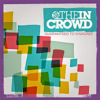
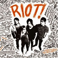
Before beginning my digipak, I researched digipaks from bands of a similar genre to mine. An obvious choice for me was the band 'Paramore' as they have been one of my style models throughout the year. I also researched 'We are the in Crowd' as they also fit neatly into the pop/rock genre.
Research Digipaks:


These Digipaks all contain bright, eye-catching colours. In order to follow the conventions of the pop/rock genre, I would have to make my digipak bright and eye-catching also, including vibrant colours to portray the pop aspect of rock/pop. These digipaks use other aspects to portray the rock genre. On 'We are the in Crowd's digipak and on 'Paramore's "RIOT", the rock genre is portrayed by rugged/messiness. For example, the word "RIOT" is written in a messy font to convey the rugged nature of rock music. My digipak also slightly follows this convention. I could not find a font that I wished to use and so I created my own font for the front of my digipak:
Because I wrote this myself with the computer mouse, the rugged, messy style is automatically present. I chose to use the paint brush tool with a jagged edge in order to create my desired style.
On the back of my digipak I continued on with my theme of colourful balloons and images of the band:
One of the main conventions for the back cover of a digipak is the list of song names on the back. I looked at a few examples and originally had numbers before each song name. However, when I got to song number 10, the lining became off and no longer looked as neat as I'd hoped:
I then found some examples, such as this Bob Mould digipak, that did not include numbers in it's list of songs. I really liked this design so I decided to remove the numbers from mine. I also included the links to the band's and company's social media pages and websites on the back page in order to allow customers to find out more.
My poster is very similar to my digipak as I have found that a lot of promo posters use a similar image to the one used on the digipak. For example, this promo poster for the album "Loud" by 'Rihanna' includes a very similar image to the digipak. This is to create synergy between the two items so that the audience can distinguish the link between the two easily.
However, because Rihanna is a very well known artist, for this particular album, there is more than one promo poster:
This promo poster includes the exact same image as the digipak. Even though Rihanna is not in the rock/pop genre, this group of pieces helped me to decide to use the same image on my digipak and poster.
My poster:
Also, similar to the promo posters above, I decided to include the date that the album would become available. This is always shown is large letters, almost as big as the band name or album title. This is because the poster isn't just to promote the Album, it's main job is to ensure that the album is bought. Displaying the availability date so large ensures that potential customers clearly know when they can own the album.
One style model I used to create my poster was 'Jake Bugg's debut album.
I really liked a lot of the conventions used on this poster. One convention of popular promo posters I used was displaying quotes from well known music magazines such as 'NME' and 'Kerrang'.
This can also be seen in my style model.
This poster also inspired me to use block-white lines in order to create some order on my poster. This was important as I wanted to include enough information to make the poster informative, but it needed to be clear and easy to read from a distance.


No comments:
Post a Comment